Here's a little recap of what we went over today:
What does the letter on each marker mean?
The letter for each marker represents the color family that the marker belongs to.
B = Blue
BG = Blue Green
BV = Blue Violet
G = Green
YG = Yellow Green
Y = Yellow
YR = Yellow Red
R = Red
RV = Red Violet
V = Violet
E = Earth
C = Cool Gray
N = Neutral Gray
T = Toner Gray
W = Warm Gray
What do the numbers on the markers mean?
Basically, the numbers represent the “qualities” of light, dark, and grays in that marker.
The first digit represents “saturation” or how vibrant the color is.
“0” will be very vibrant. “9” will be more earthy / gray.
** “E” Earth markers do not necessarily follow this. **
The last digit represents how light the marker is within that “saturation group”.
Anything with a “1” on the end will be lighter than a “5”, which is more of a mid-tone, and “9” which will be much darker.
Here's visual that might help...
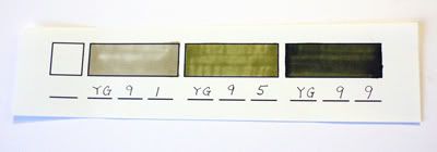
The Yellow Green marker is in the "90" group, which is as gray as it gets for this family color.
The YG91 is the lightest that I have in this group. Then I went to the middle of this group with my YG95. You can see that it is more saturated in color. Then the darkest marker in this color family is YG99 shows you just how much more earthier in tone and how much more saturated it is, compared to YG91.
The exception to all this is the E (Earth) markers.
Here's a visual:

This shows you a little of the graduation in colors but this will not apply to all of the other E markers.
The Copic Markers:
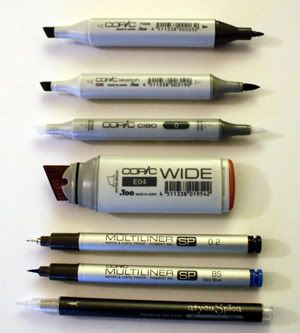
Copic (Original) – 214 colors*
Sketch – 322 colors
Ciao – 144 colors
Wide – 32 colors*
Multiliners - Black multiliners are available in 0.05, 0.1, 0.3, 0.5, 0.8, 1.0mm
- Brush Small (BS) and Brush Medium (BM).
- Colored Multiliners are available in sizes 0.05, 0.1, 0.3, and 0.5mm.
atyou Spica glitter pens
• Non-Toxic
• Acid-Free
• Archival
• Transparent (perfect for adding a splash of color or bling overlays)
• No-Clog Tip
• Pigment Based
• Contains micro glass flakes for beautiful sparkle
• Twice the writing length of other pens (Over 360 Yards)
There are 23 colors plus the clear glitter pen!
It is very important to keep these markers on their sides (horizontally).
* Copic and Wide markers have empty markers available that can be filled with any of the available 322 colors
The markers are different in the style of their bodies and replaceable tips as well as how much ink they can hold. For example, the Copic Marker is square body design which is very different to the oval body design of the Sketch markers and the round body design of the Ciao markers. Copic Markers can evenly cover 5 sheets of copy paper and streak another page before running out of ink. The Sketch marker will evenly cover about 4 sheets and streak 3/4th of another sheet of paper. The Ciao markers will cover even less.
Speaking of tips and designs, here's a closeup of the different tips and how small the multiliners can get. The .03mm is the smallest tip in the world! Marianne was on the phone with NASA and Copic almost made it to outerspace! Unfortunately, they wanted to get to .05mm. Phooey!
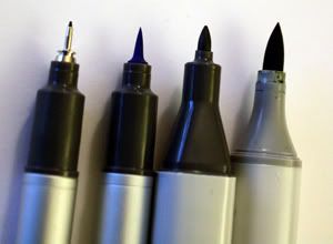
Here's a little "tip"...
To make it easier on yourself to find the special end of your marker (ie. brush end or small tip end) just look for the dark gray band on your marker.
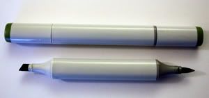
I use both the Copic and the Sketch markers. For me, it really depends on the color that I am looking for and the overall effect that I desire… and sometimes the technique that I am using. Because of the option for replaceable nibs, I suggest going with color first and then with your personal preference for the style of markers.
I store them in groups according to their last digit.
0-3, 4-6, 7-9, neutrals & blenders
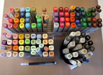
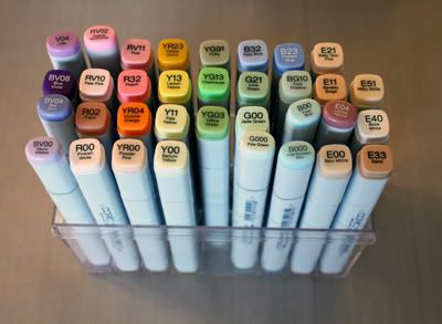
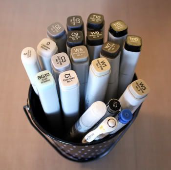
What is the difference between the grays?
Cool Grays – bluish / “cool” (ie. metal, shadow on ice)
Neutral Grays – no tone, neither warm nor cool
Toner Grays – slightly warmer than neutral – “brown”
Warm Grays – browner than any of the other grays (earthy)
Black 100 & Black 110
There is a difference between these two black markers!
The 100 is “true” black… deep blue black.
The 110 is more of a “matte” black… slightly neutral gray black.
If there ever was a “T11” marker, it would be the Black 110.
Where to start?
I like to start with a color that I like.
Practicing with a few different colors that compliment each other is the way I would go before jumping in and purchasing different shades of the same color. I like to call it "Coloring with limited Copics". You can easily create different shades with the same marker by using it with just a few strokes (original color), going over it several times (darker), or using the blender to lighten it.
Once you are comfortable using these awesome markers and you want to build your stash, I would choose one or two colors from that color family that will naturally blend well together. To find these colors, simply stick to the same letter and first digit of your marker, and select another marker that is 2-3 digits between the last digit on your marker.
Let’s use “BV04” as an example. I could choose “BV00” and “BV06”
* On a side note, any of the “00” and “000” markers would be a good buy when thinking of ways to make your selected marker work without having to buy a lot of markers. I showed you how you can use “00” and “000” markers to blend using various techniques (ie. "plastic" and "tip to tip").
Now, if you want to take this a step further and find markers that blend across color families, then choose markers that have different letters but similar numbers. Also, be sure to stay close to the color families on the color wheel. It would be harder to evenly blend colors that are opposite of each other on the 322 color wheel.
Here's a visual:
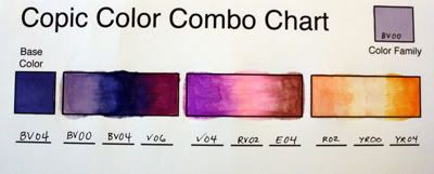
The Colorless Blender “0”
The word “Blender” is bit deceiving. This marker is not really a “blender” in the way you might anticipate it to be, but is more for lightening colors, pushing colors, and fading colors to white. I like to use the blender to bring two colors together more smoothly, create highlights, and erase mistakes (as best as I possibly can). It’s also good for wetting the area I am about to color so that when I do apply color to the moistened area, it will be much softer. Let’s not forget a few fun techniques using this “must have” blender.
“Bluing” to make your whites, whiter!

I have read that color experts can distinguish somewhere over 300 different shades of white… the most brilliant white having a slight hue of blue. So in order to make your whites “pop” off the page, I suggest “bluing” your image. Go around the white parts that you want to stand out with a very light shade of bright blue, such as BG10. More often than not, it is just a little too distinct for me so I go back over the blue with my Blender pen and soften up the line.

True white “snow”
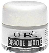
I have been asked how to add “true white” with Copics. We have markers with white in them but to get bright white on your projects such as snow, then I suggest using Copic Opaque White (water-based, thick white paint) or if working with less area coverage, the Signo White Gel Pen. The Opaque White is applied with a paintbrush as you are finishing your project and is much like icing on a cake. You can thin it out with water for a thinner glaze. This glaze is fabulous for adding highlights and thinning it down to make clouds in the sky or for making things look shimmery or shiny.
Let's see... what else did we go over?
Recommended Cardstock:
Coconut Swirl (Bazzill)
Neenah Classic Solar White 80lb. smooth finish
Pure Luxury (Gina K Designs)
Select White (Papertrey Ink)
Georgia Pacific (Walmart)
Simply Smooth White (Prism)
Strathmore Smooth Bristol
Stampin' Up Whisper White (some don't care for the glossy finish)
Recommended ink:
Memento Tuxedo Black (dries quickly and does not need to be heat set
Brilliance Graphite Black (must heat set or heat embossed but has a beautiful rich color)
I will post a few more things about Copics soon, including a few fun techniques that I showed during the demonstrations. Be sure to check back on Monday for a Copic Marker Monday's Fun Day Giveaway!
In the meantime, if you have any questions... please feel free to contact me at:
whoopsie.daisy@sbcglobal.net
Thank you!
Jane
